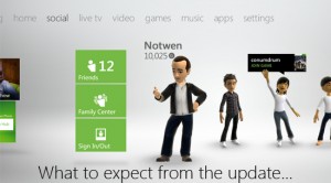
Today saw the implementation of the new dashboard and new functionality for Xbox 360 after a very slight (and unexplained) delay. PopCultureMonster has spent today getting to grips wth the new look and feel (and people say we don’t do real work).
The new look is modelled on the Windows Phone OS and as such is made up of a series of boxes for each category. The opening page is games with the others comprising, video, marketplace, settings, social and Bing search. The at-a-glance layout and side-scrolling layout appear to be geared at Kinect users initially disappointed with the level of control offered by the motion sensor. The ease of use with Kinect will also lure in a Christmas market either new to the console or just lacking the Kinect itself.
The new dashboard is clearly the culmination of a great deal of work Microsoft have put into integrating the Windows Phone, Xbox 360 and Kinect and it looks like all of that work has finally paid off, taking the dashboard from drab lines of options to a dynamic, changing interface.
As well as a brand new look, the 360 has also received some exciting new features. The first and probably most welcome is the implementation of cloud saved game storage. Now gamers need not worry about taking their gamertag and saved games mobile on USB. Instead, if one happens to find oneself in a position to do some gaming on the go, saved games can be retrieved from the cloud along with gamertag recovery, meaning you no longer have to fiddle around with memory devices.
Next we have beacons, whereby gamers can let their friends know what they’re hankering to play and get a crew together. If you’re in the mood for a bit of multiplayer and don’t know what you fancy, keep an eye out for beacons and jump in on your friends’ games.
The final feature, while not such a major deal functionally is definitely a bit of fun. First mooted in 2009, gamers are now able to share achievements to a connected Facebook account. Personally, we’re hoping this is just the first step, with screenshots and Twitter sharing to follow.
All in all we haven’t found anything to slam when it comes to this update. It’s sleek, it’s sexy and maintains all of the original features of the old dashboard but better looking. Think of it like Stephen Hawking’s brain in Heidi Klum’s body.
Leave a comment and let us know what you think of the new look.


